Thursday, September 2, 2010

Week 6 last blog for semester 2-Barbara Kruger


American conceptual/pop artistBarbara Kruger is internationally renowned for her signature black, white and red poster-style works of art that convey in-your-face messages on women's rights and issues of power. Coming out of the magazine publishing industry, Kruger knows precisely how to capture the viewer's attention with her bold and witty photomurals displayed on billboards, bus stops and public transportation as well as in major museums and galleries wordwide. She has edited books on cultural theory, including Remaking History for the Dia Foundation, and has published articles in the New York Times, Artforum, and other periodicals. Monographs on her work include Love for Sale, We Won't Play Nature to Your Culture and others. She is represented in New York by Mary Boone Gallery. A major exhibition of her work will be presented at the Museum of Contemporary Art in Los Angeles in fall 1999, and at the Whitney Museum in New York in 2000.

Research Kruger's work to find an example from the 1970s or 1980s to compare with a more recent work. How has Kruger's work changed with the developments in contemporary visual arts? Describe a recent work that moves away from the 'poster' type work of her early career.

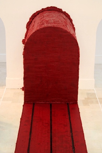
Barbara Kruger is an American conceptual artist. Much of her work consists of black and white photographs overlaid with declarative captions—in white-on-red Futura Bold Oblique. The phrases in her works often include use of pronouns. Kruger's photographs is mainly constructed around the idea of self-identity, desire and public opinions towards ourselves, which is an on-going manipulation from the mass media.
Find 2-3 works by Kruger to add to your blog.


How does the audience experience a more spatial, installation art work compared with a poster?
Everyone has there own point of view but for me
a spatial or installation artwork is where people always get a sense of the whole space instead of the work itself. While for a poster, it’s more about the visual communication.
What elements does Kruger use in her work to create a strong impact?
She makes her work Big, Bold, Red, Black, White, it captures the eye.

Comment on the development of her work over the last 30 years.
Kruger work has changed a lot over the year's she has gone from cut-and-paste method, to digital technology. Her installations are now typically built electronically, and conveyed via digital files to printers and fabricators. Still, as much as technology has altered her process, the most dramatic change in her work has been on the cultural front.

www.barbarakruger.com/

Kahinde Wiley


Kahinde Wiley is a Gay American based painter born in Los Angeles, who has an international reputation living between Pe King and Brooklyn
Last weeks ALVC class focused on the Post Modern them "INTERTEXTUALITY", re-read Extract 1 The death of the author on page 44 of your ALVC books and respond to the oil paintings of Kehinde Wiley. How do we make sense of his Kehinde's work? Identify intertextuality in Kehinde's work?

Wiley is known for his paintings of contemporary urban African American men in poses taken from the annals of art history.. Most of his works are in portrait form. Wiley's paintings are very beautiful, usually focusing on one or two subjects present his work. Maybe he drew some of his inspiration from the renaissance that and also foregin textiles with a lot of Victorian influences.

Kehinde's work relates to this weeks Post Modern theme "PLURALISM" re-read page 50 and discuss how the work relates to this theme?

Pluralism meaning the social concept of an artist regardless of there race,age,beliefs. His work relates to pluralism because his pieces contains something which is so normal for the type of paintings style he chose. This type of painting style was usually found during the time of the renaissance at which point people would have a painted portrait of themselves to show their position or wealth in the world. however in Wileys work he was able to diverse his subject while still keeping to the traditional style.He changed the perception on people view.


Saturday, August 28, 2010


Celebrated for his gigantic, stainless steel 'Cloud Gate' sculpture in Chicago’s Millennium Park, Anish Kapoor is changing the cultural environment with his public works.

1.Research Kapoor's work in order to discuss the ideas behind 3 quite different works from countries outside New Zealand.

Cloud Gate

The 110-ton Cloud Gate sculpture is forged of a seamless series of highly-polished stainless steel "plates" that create an elliptically-arched, highly-reflective work with Chicago's skyline and Millennium Park itself as a dramatic backdrop. Visitors fully experience the majestic nature of the work by literally walking through and around, as it was designed for public interaction. Inspired by liquid mercury, the sculpture is among the largest in the world, measuring 66-feet-long by 33-feet high. The plaza upon which Cloud Gale sits was made possible by a gift from the SBC Corporation.


Svayambhu (meaning self-generated or auto generated)

This is another one of kapoors sculpture that is creating itself. Svayambh takes the form of a train track, covered with ruby-red wax. The track runs the entire length of several adjoining galleries. A 30-tonne red wax engine traverses the track at a snail's pace, squeezing itself through doorways, forming its own shape.


Tall Tree and the Eye

There is nothing heavy or imposing about it, but there is something quite improbable. You cannot tell how it has been put up and that is part of its mystery and dignity.
The steel structure, an arrangement of 76 shiny spheres which bubble up to the level of the surrounding Palladian buildings, is inspired by the words of the German poet Rainer Maria Rilke.

photo


2.Discuss the large scale site specific work that has been installed on a private site in New Zealand.

The sculpture is fabricated in a custom deep red PVC-coated polyester fabric by Ferrari Textiles supported by two identical matching red structural steel ellipses that weigh 42,750kg each. The fabric alone weighs 7,200kg. The sculpture, which passes through a carefully cut hillside, provides a kaleidoscopic view of the beautiful Kaipara Harbor at the vertical ellipse end and the hand contoured rolling valleys and hills of “The Farm” from the horizontal ellipse.

3. Where is the Kapoor's work in New Zealand? What are its form and materials? What are the ideas behind the work?

The Farm,” a 400ha (1,000 acre) private estate outdoor art gallery in Kaipara Bay, north of Auckland, New Zealand. Kapoor’s first outdoor sculpture in fabric, “The Farm” (the sculpture is named after its site), is designed to withstand the high winds that blow inland from the Tasman Sea off the northwest coast of New Zealand’s North Island.


www.anishkapoor.com/www.anishkapoor.com/www.anishkapoor.com/
www.anishkapoor.com/

The Walters Prize

This week we will be visiting the Auckland Art Gallery to view, research and write about the artists selected for the Walters Prize 2010. Discuss the work in the gallery with your tutors and other students and answer the following questions.

1. What is the background to the Walters Prize?

The Walters Prize is a biennial award for New Zealand artists who have made an outstanding contribution to the visual arts in the previous two years. Honouring the life and artistic legacy of Gordon Walters (1919 – 1995), the award was founded by the Auckland Art Gallery in 2002. The prize includes NZ$50,000 and an all expense paid trip to New York to exhibit at Saatchi & Saatchi’s world headquarters.


2. List the 4 selected artists for 2010 and briefly describe their work.

Saskia Leek

Yellow is the putty of the world 2009
Her paintings that respond directly to the look and the mood of sun-faded prints and Paint By Numbers pastels, and is treated in the exhibition Yellow is the Putty of the World more clearly as a subject in itself. Saskia painting has long honoured the appeals of popular images.

Fiona Connor

Something Transparent (please go round the back) 2009, mixed media
Fiona Connor’s intriguing sculptural proposition Something Transparent makes the most of the unsettling potential of the double-take. Positioning multiple reproductions of the glass façade and public entrance to the gallery in situ one behind the next, Connor’s work is both visually captivating and compelling conceptually.

Dan Arps

Explaining things 2008, mixed media
He has made careful formal gestures with materials as banal as breakfast cereal and sheets of newspaper - things a long way from the everyday idea of art. At the same time, he has made gestural paintings and elaborate objects.

Alex Monteith

Passing Manoeuvre with two motorcycles and 584 vehicles for two-channel video installation 2008
Alex Monteith has taken advantage of contemporary technology to update the kinds of image-making experiments undertaken by structuralist filmmakers in the 1960s, deriving a formal composition from the action of vehicles.

3. Who are the jury members for 2010?

Joy Bywater, Rhana Devenport, Leonhard Emmerling and Kate Montgomery.


4. Who is the judge for 2010 and what is his position in the art world?

The former-director of London's Tate Modern, Vicente Todoli will judge the Walters Prize 2010 and announce the award winner on 8 October.Todolí was artistic director for The Valencia Institute for Modern Art (IVAM), Spain, and before it opened he was their Chief curator. Throughout his distinguished career he organised and curated internationally renowned exhibitions of work by contemporary artists, making him the perfect choice to be this years judge.


5. Who would you nominate for this years Walter's Prize, and why? Substantiate
you answer by outlining the strengths of the artists work. How does this relate
to your interests in art? What aspect of their work is successful in your opinion,
in terms of ideas, materials and/or installation of the work?


http://nzcontemporary.com/contemporary-art-prizes/the-walters-prize/

Monday, August 16, 2010

Hussein Chalayan is an artist and designer, working in film, dress and installation art. Research Chalayan’s work, and then consider these questions in some thoughtful reflective writing.


1. Chalayan’s works in clothing, like Afterwords (2000) andBurka (1996) , are often challenging to both the viewer and the wearer. What are your personal responses to these works? Are Afterwords and Burka fashion, or are they art? What is the difference?

Not all clothing is fashion, so what makes fashion fashion?

I think what makes fashion fashion, is when you get someone such as celebrities/models who has a strong influence on others, put them in a piece of clothing made by recognized designers, and pop the image of them wearing those clothes out in the media. that would probably be considered as fashion.


Hussein Chalayan, Burka, 1996


Hussein Chalayan, Afterwords, 2000

2. Chalayan has strong links to industry. Pieces like TheLevel Tunnel (2006) and Repose (2006) are made in collaboration with, and paid for by, commercial business; in these cases, a vodka company and a crystal manufacturer. How does this impact on the nature of Chalayan’s work? Does the meaning of art change when it is used to sell products? Is it still art?

I don't think the meaning of art changes. It is still Hussein Chalayan’s work. Just because it is paid for by a commercial company doesn’t make it less of an art piece. I don’t think art changes when selling products.

3. Chalayan’s film Absent Presence screened at the 2005 Venice Biennale. It features the process of caring for worn clothes, and retrieving and analysing the traces of the wearer, in the form of DNA. This work has been influenced by many different art movements; can you think of some, and in what ways they might have inspired Chalayan’s approach?


Hussein Chalayan, still from Absent Presence, 2005 (motion picture)


4. Many of Chalayan’s pieces are physically designed and constructed by someone else; for example, sculptor Lone Sigurdsson made some works from Chalayan’s Echoform(1999) and Before Minus Now (2000) fashion ranges. In fashion design this is standard practice, but in art it remains unexpected. Work by artists such as Jackson Pollock hold their value in the fact that he personally made the painting. Contrastingly, Andy Warhol’s pop art was largely produced in a New York collective called The Factory, and many of his silk-screened works were produced by assistants. Contemporarily, Damien Hirst doesn’t personally build his vitrines or preserve the sharks himself. So when and why is it important that the artist personally made the piece?

I think sometimes artist ideas can be to big of a project to handle on their own,sometimes they need someones help who has the right experience to assist them in their project, so the artist plan can be properly executed. however i think most of the work has to be done by the artist themselves because it is their work.


Monday, July 26, 2010

Nathalie Djurberg

1. What do you understand by the word 'claymation'?

An animation process using clay or Plasticine figures that are moved and filmed using stop-motion photography to create a lifelike look.

2. What is meant by the term 'surrealistic Garden of Eden'? and 'all that is natural goes awry'?’

My interpretation to the term surrealistic Garden of Eden is a reverse description of the Garden of Eden. It’s made to look disoriented, hallucinatory and has a quality of a dream and all that is natural and normal goes wrong.

3. What are the 'complexity of emotions' that Djurberg confronts us with?

Djurberg was trying confront us with is the feeling of fear of the unknown and the not understood.

4. How does Djurberg play with the ideas of children's stories, and innocence in some of her work

Djurberg plays with the idea of children stories and creates such composite emotions using the characters of stories. She makes the innocent not so innocent.

There is a current fascination by some designers with turning the innocent and sweet into something disturbing. Why do you think this has come about?

I think media has a lot to do with the corruption of innocents. They twist awful thing and make them look good, they attack us with so much crap, that people tend to think that unpleasant thing are regular and gain dirty habitats at a very young age, innocents could become a thing of the past.

In your opinion, why do you think Djurberg's work is so interesting that it was chosen for the Venice Biennale?

I think this must take a lot of time and a lot of hours and a lot of patience’s to make such a complicated film and get everything perfect. Overall love the creativity that went into making it, it all looks very extraordinary.


Monday, June 7, 2010

Last blog question for semester one- Banksy's work

Banksy is a pseudonymous British graffiti artist. He is believed to be a native of Yate, South Gloucestershire, near Bristol and to have been born in 1974, but his identity is unknown. According to Tristan Manco,[who?] Banksy "was born in 1974 and raised in Bristol, England. The son of a photocopier technician, he trained as a butcher but became involved in graffiti during the great Bristol aerosol boom of the late 1980s." His artworks are often satirical pieces of art on topics such as politics, culture, and ethics. His street art, which combines graffiti writing with a distinctive stencilling technique, is similar to Blek le Rat, who began to work with stencils in 1981 in Paris and members of the anarcho-punk band Crass who maintained a graffiti stencil campaign on the London Tube System in the late 1970s and early 1980s. His art has appeared in cities around the world. Banksy's work was born out of the Bristol underground scene which involved collaborations between artists and musicians.

Banksy does not sell photos of street graffiti. Art auctioneers have been known to attempt to sell his street art on location and leave the problem of its removal in the hands of the winning bidder.

Banksy's first film, Exit Through the Gift Shop, billed as "the world's first street art disaster movie", made its debut at the 2010 Sundance Film Festival. The film was released in the UK on March5.

Banksy is legendary. In the UK, he’s pretty much a household name. Yet, mysteriously, very few people know who he really is. Those who do have done well through the years in keeping his name secret from the real public.

Much of Banksy’s work is humorous, and others have been known for subverting the media and popular icons. He’s had pieces of the Mona Lisa with a rocket launcher, crafted his own fake copies of Paris Hilton’s debut album, and made one of the UK’s most famous graffiti pieces — the one of two policemen kissing. Many of his projects have no doubt walked the line between the legal and the illegal, and some have clearly been illegal. Yet, no one has truly known who he was, and he has been safe from much scrutiny because of it.

But today the Daily Mail published an article that reveals who Banksy really is — or so they claim. It shows pictures of his work and house ‘he’ grew up in, reveals ‘his’ full name, and practically tells ‘his’ life story before he became Banksy. The article closes with a quote that Banksy by Banksy himself, saying to Swindle Magazine, “I have no interest in ever coming out. I figure there are enough self-opinionated a**holes trying to get their ugly little faces in front of you as it is.”

So why would the Daily Mail decide to share all this information and more (given that it is true)? It seems rather disrespectful.

If they aren’t correct, what about poor Robin Gunningham? Harassment incoming? People seem to be citing obituaries that detail a couple of deceased Robin Gunninghams… but that’s hardly worth anything, because who knows how many there are?

http://www.google.co.nz/imgres?imgurl=http://artandmusic.files.wordpress.com/2008/07/071208-

http://en.wikipedia.org/